Creating a Color Box Set with CSS
Aug 5, 2024

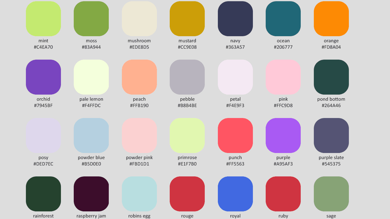
In web design, color plays a crucial role in creating visually appealing and engaging user interfaces. One way to showcase a set of colors is by creating a color box set using HTML and CSS. In this blog post, we'll explore how to create a color box set and provide practical code snippets to help you get started.
Understanding the Box Model in CSS
Before we dive into creating the color box set, it's essential to understand the CSS box model. The box model is a fundamental concept in CSS that defines how elements are sized and positioned on a webpage. Each HTML element is considered a box, and the box model consists of four main components:
Content: The actual content of the element, such as text or images.
Padding: The transparent area surrounding the content.
Border: A border that goes around the padding and content.
Margin: The transparent area outside the border.
By understanding the box model, you can precisely control the size and spacing of your color boxes.
Creating the HTML Structure
To create a color box set, we'll start by setting up the HTML structure. Here's an example:
In this example, we have a parent div with the class color-box-set that contains four child div elements with the class color-box. Each child div represents a single color box.
Styling the Color Boxes with CSS
Now that we have the HTML structure in place, let's style the color boxes using CSS. Here's an example:
Let's break down the CSS code:
The
.color-box-setclass usesdisplay: flexto create a flexible container for the color boxes.flex-wrap: wrapallows the boxes to wrap to the next line if needed.justify-content: centercenters the boxes horizontally, andgap: 20pxadds spacing between the boxes.The
.color-boxclass sets the width and height of each color box to100px.border-radius: 10pxadds rounded corners to the boxes.box-shadow: 0 2px 5px rgba(0, 0, 0, 0.1)adds a subtle drop shadow to the boxes.The individual color classes (
.red,.green,.blue,.yellow) set the background color of each box using hexadecimal color codes.
Customizing the Color Boxes
You can further customize the color boxes by adjusting the CSS properties. Here are a few examples:
Change the box size by modifying the
widthandheightproperties.Adjust the border radius to create different shapes (e.g.,
border-radius: 50%for circles).Add a border to the boxes using the
borderproperty.Modify the box shadow by changing the values in the
box-shadowproperty.Use different color codes (e.g., RGB, HSL, named colors) to change the box colors.
Here's an example of how you can add a border to the color boxes:
By combining these CSS properties, you can create unique and visually appealing color box sets that suit your design needs.
Responsive Design Considerations
When creating a color box set, it's important to consider responsive design to ensure your layout looks good on different screen sizes. You can use CSS media queries to adjust the layout based on the device's screen size. Here's an example of how you can make the color boxes responsive:
In this example, when the screen width is less than or equal to 768px (commonly used for tablets and smaller screens), the color boxes will have a width and height of 80px.You can further customize the responsive styles by adjusting the number of boxes per row, the spacing between boxes, or any other CSS properties.
Accessibility Considerations
When creating a color box set, it's essential to consider accessibility. Ensure that your color choices provide sufficient contrast for users with visual impairments. You can use online tools like the WebAIM Color Contrast Checker to test the contrast ratio of your colors.Additionally, consider providing alternative text descriptions for the color boxes using the aria-label attribute. This helps users with screen readers understand the purpose and content of each box.Here's an example of how you can add aria-label attributes to the color boxes:
By following these accessibility guidelines, you can create a color box set that is inclusive and usable for all users.
Conclusion
Creating a color box set with CSS is a simple yet effective way to showcase a set of colors on your website. By understanding the CSS box model and using flexbox for layout, you can create visually appealing and responsive color box sets.Remember to consider accessibility when choosing colors and providing alternative text descriptions. With the code snippets and guidelines provided in this blog post, you should have a solid foundation to create your own color box sets.
Happy coding!