Creating a Dropdown Menu That Pushes Content with CSS

Jul 28, 2024

Creating a Dropdown Menu That Pushes Content with CSS

Dropdown menus are a vital component of modern web design, providing a user-friendly way to navigate through a website. This blog post will guide you through creating a dropdown menu that not only appears on user interaction but also pushes the content below it down, enhancing the overall user experience. We will cover the essential HTML and CSS code snippets, along with explanations on how to implement and customize your dropdown menu.

Understanding Dropdown Menus

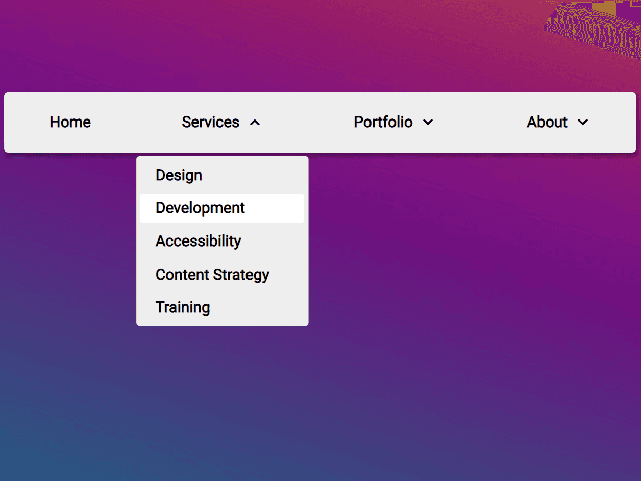
A dropdown menu is a UI element that allows users to select an option from a list that appears when they interact with a designated area, such as a button or a navigation link. Unlike traditional dropdowns that overlay content, we will focus on creating a menu that pushes the content down when activated. This approach ensures that the dropdown items are clearly visible and do not overlap with other elements on the page.

Setting Up Your HTML Structure

To create a dropdown menu that pushes content down, we first need to set up a basic HTML structure. Here’s a simple example:

<!DOCTYPE html>
<html lang="en">
<head>
    <meta charset="UTF-8">
    <meta name="viewport" content="width=device-width, initial-scale=1.0">
    <link rel="stylesheet" href="styles.css">
    <title>Dropdown Menu Example</title>
</head>
<body>
    <nav class="navbar">
        <div class="dropdown">
            <button class="dropbtn">Menu</button>
            <div class="dropdown-content">
                <a href="#">Link 1</a>
                <a href="#">Link 2</a>
                <a href="#">Link 3</a>
            </div>
        </div>
    </nav>
    <div class="content">
        <h1>Welcome to Our Website</h1>
        <p>This is some content below the dropdown menu.</p>
    </div>
</body>
</html>

CSS for the Dropdown Menu

Now, let’s style the dropdown menu using CSS. The key here is to set the dropdown content to be displayed as a block when the button is clicked, which will push the content below it down. Here’s how you can do it:

/* styles.css */

* {
    box-sizing: border-box;
    margin: 0;
    padding: 0;
}

body {
    font-family: Arial, sans-serif;
}

.navbar {
    background-color: #333;
    overflow: hidden;
}

.dropdown {
    position: relative;
    display: inline-block;
}

.dropbtn {
    background-color: #4CAF50;
    color: white;
    padding: 16px;
    font-size: 16px;
    border: none;
    cursor: pointer;
}

.dropdown-content {
    display: none; /* Hidden by default */
    position: relative; /* Changed from absolute to relative */
    background-color: #f9f9f9;
    min-width: 160px;
    box-shadow: 0px 8px 16px 0px rgba(0,0,0,0.2);
    z-index: 1;
}

.dropdown-content a {
    color: black;
    padding: 12px 16px;
    text-decoration: none;
    display: block;
}

.dropdown-content a:hover {
    background-color: #ddd;
}

/* Show the dropdown content when the button is clicked */
.dropdown:hover .dropdown-content {
    display: block;
}

/* Push content down when dropdown is active */
.dropdown:focus-within .dropdown-content {
    display: block;
}

Explanation of CSS Properties

  • Positioning: By setting the .dropdown-content to position: relative, it allows the dropdown to affect the layout of the page, pushing the content down instead of overlaying it.

  • Display Control: The display: none property hides the dropdown content by default. The :hover and :focus-within pseudo-classes are used to show the dropdown when the user interacts with the button.

  • Styling: Basic styling is applied to ensure the dropdown looks visually appealing and is easy to navigate.

Enhancing Accessibility

To make your dropdown menu accessible, consider the following enhancements:

  • Keyboard Navigation: Ensure that users can navigate through the dropdown items using the keyboard. This can be achieved by adding tabindex attributes to the dropdown items and handling keyboard events with JavaScript.

  • ARIA Roles: Use ARIA roles to improve screen reader compatibility. For instance, you can add role="menu" to the dropdown and role="menuitem" to each link.

Example of a Complete Dropdown Menu

Here’s a complete example that integrates all the concepts discussed:

<!DOCTYPE html>
<html lang="en">
<head>
    <meta charset="UTF-8">
    <meta name="viewport" content="width=device-width, initial-scale=1.0">
    <link rel="stylesheet" href="styles.css">
    <title>Dropdown Menu Example</title>
</head>
<body>
    <nav class="navbar">
        <div class="dropdown" role="menu">
            <button class="dropbtn" aria-haspopup="true" aria-expanded="false">Menu</button>
            <div class="dropdown-content" role="menu">
                <a href="#" role="menuitem">Link 1</a>
                <a href="#" role="menuitem">Link 2</a>
                <a href="#" role="menuitem">Link 3</a>
            </div>
        </div>
    </nav>
    <div class="content">
        <h1>Welcome to Our Website</h1>
        <p>This is some content below the dropdown menu.</p>
    </div>
</body>
</html>

JavaScript for Enhanced Interaction

For a more dynamic experience, you can use JavaScript to handle clicks on the dropdown button, allowing it to toggle the visibility of the dropdown content:

// script.js

document.addEventListener('DOMContentLoaded', function () {
    const dropbtn = document.querySelector('.dropbtn');
    const dropdownContent = document.querySelector('.dropdown-content');

    dropbtn.addEventListener('click', function () {
        dropdownContent.style.display = dropdownContent.style.display === 'block' ? 'none' : 'block';
    });
});

Conclusion

Creating a dropdown menu that pushes content down when activated is a great way to enhance user experience on your website. By following the HTML and CSS examples provided, you can easily implement this feature. Remember to consider accessibility and usability in your designs to ensure all users can navigate your site effectively.