Mastering Flex Design Background
Jul 29, 2024
In the ever-evolving world of web design, understanding the concept of flex design background is crucial for creating visually appealing and user-friendly websites. This guide will delve into the intricacies of flex design, its applications, and how it can enhance your website's aesthetics and functionality.
Understanding Flex Design Background
Flex design refers to the use of CSS Flexbox, a layout model that allows for the efficient arrangement of elements within a container. This model is particularly useful for creating responsive designs that adapt seamlessly to various screen sizes. The flex design background serves as the foundation for modern web layouts, enabling developers to create dynamic and flexible user interfaces.
Key Features of Flexbox
Flex Container: The parent element that holds the flex items. Setting the display property to
flex transformsthis element into a flex container.Flex Items: The children of the flex container that can be manipulated and arranged in various ways.
Responsive Design: Flexbox allows for easy adjustments to the layout based on the screen size, making it ideal for mobile-friendly designs.
The Importance of Flex Design Background in SEO
A well-structured flex design background not only enhances user experience but also plays a significant role in SEO. Here’s how:
Improved User Experience: Websites that utilize flexbox layouts are often more intuitive and easier to navigate, which can lead to lower bounce rates and higher engagement.
Faster Load Times: Flexbox can help streamline the design, reducing the amount of code and improving load times, a critical factor in SEO rankings.
Mobile Optimization: With the increasing use of mobile devices, having a responsive design is essential. Flexbox makes it easier to create layouts that look great on any device.
Implementing Flexbox: A Practical Guide
To effectively use flex design in your projects, you need to understand how to implement it in your CSS. Below are some essential code snippets to get you started.
Basic Flexbox Setup
This code sets up a basic flex container with three items. Each item is styled to stand out against the background.
Advanced Flexbox Techniques
Once you're comfortable with the basics, you can explore more advanced features of flexbox.
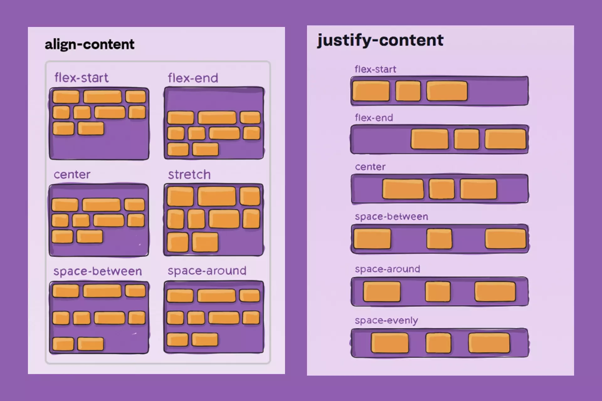
Aligning Items
You can align items within the flex container using properties like justify-content and align-items.
Flex Item Properties
Flex items can also be manipulated individually. For example, you can control their size and order.
Creating a Flex Banner Design
Flex banners are a popular application of flex design, especially in advertising. Here’s how to create an effective flex banner using the principles of flex design.
Steps to Design a Flex Banner
Choose the Right Dimensions: Common sizes for flex banners range from 1 meter to 5 meters in width. Ensure you select dimensions that fit your advertising space.
Set Up Your Document: Use design software like Photoshop to create your banner. Set the resolution to 72 pixels per inch for large banners.
Design Your Background: Utilize a solid color or gradient that aligns with your brand identity.
Add Text and Images: Ensure your text is legible from a distance. Use high-resolution images to maintain quality.
Export Your Design: Save your design in a format suitable for printing, such as JPEG or TIFF.
Best Practices for Flex Design Background
To maximize the effectiveness of your flex design background, consider the following best practices:
Maintain Consistency: Use a consistent color palette and typography throughout your design to strengthen brand identity.
Prioritize Readability: Ensure that text contrasts well with the background. Use tools to check color contrast ratios.
Test Responsiveness: Always test your design on multiple devices to ensure it looks great everywhere.
Conclusion
Theflex design backgroundis a powerful tool in modern web design, combining aesthetics with functionality. By leveraging the capabilities of CSS Flexbox, you can create responsive, user-friendly layouts that enhance both user experience and SEO performance. Whether you're designing a website or a flex banner, understanding and implementing flex design principles will set you on the path to success in the digital landscape.By following the guidelines and code snippets provided in this guide, you can master flex design and create stunning, effective designs that capture your audience's attention. Embrace the flexibility and power of this design approach, and watch your web projects thrive!